Dark Mode Web Design: What It Is and Why It Matters for Your Business
Dark mode web design has shifted from a niche aesthetic preference to a legitimate strategic consideration for brands that care about user experience and digital performance. If your company has a website, and in 2026 it absolutely should, understanding dark mode is no longer optional. It is the kind of design decision that touches accessibility, brand perception, technical performance, and even how long visitors stay on your pages. This article breaks down what dark mode actually is, how it functions beneath the surface, and whether it deserves a place in your digital strategy.
What Is Dark Mode Web Design, Exactly
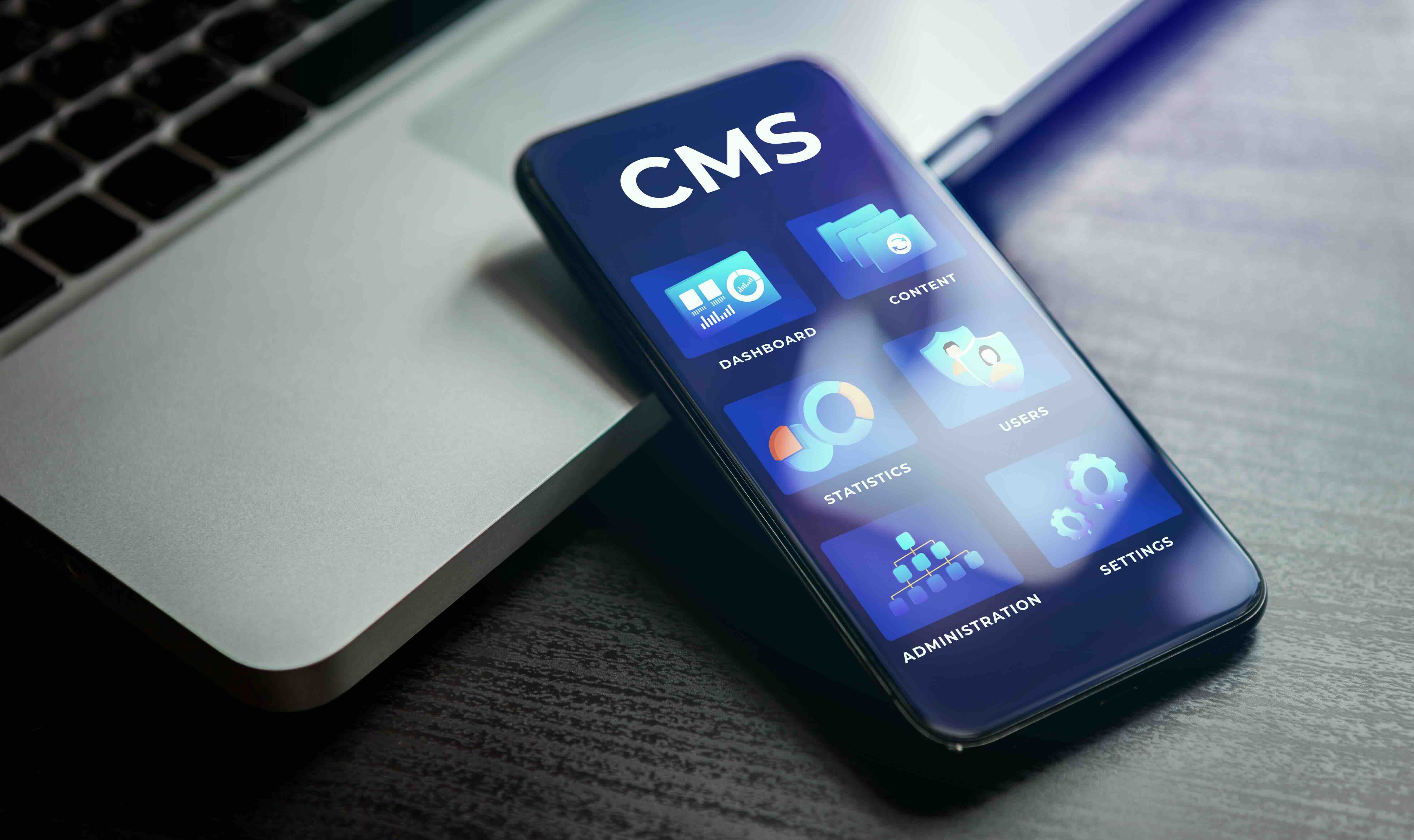
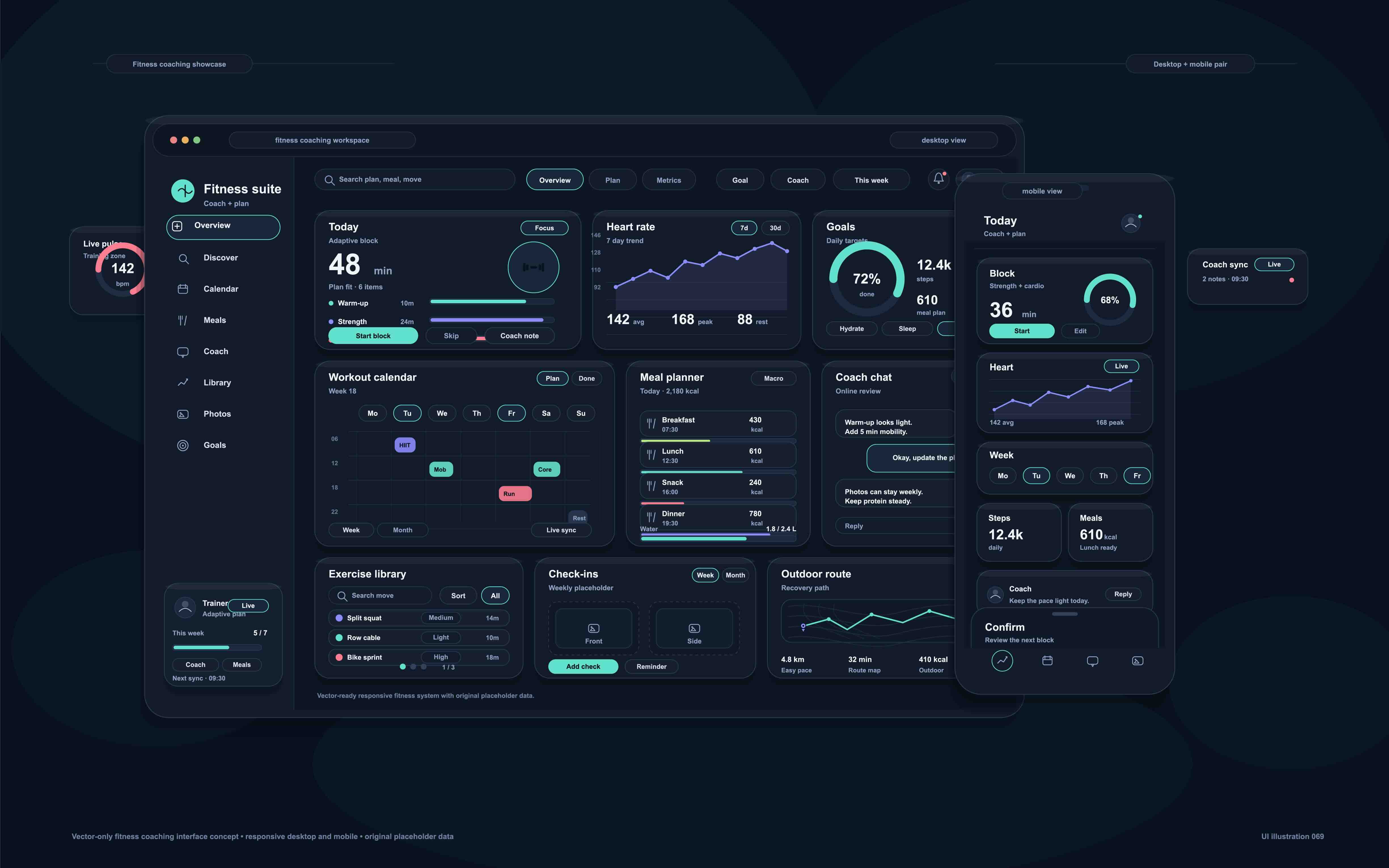
Dark mode web design refers to a color scheme that uses dark backgrounds, typically deep grays, near-blacks, or rich dark hues, paired with lighter text and interface elements. It is the visual inverse of the traditional light mode, which relies on white or off-white backgrounds with dark typography. The concept is not new, but its widespread adoption across operating systems, applications, and websites has made it a standard consideration in modern web development. Browsers and operating systems now expose a CSS media feature called prefers-color-scheme, which allows developers to detect a user's system-level preference and render the site accordingly. This means a well-built dark mode experience is not simply a coat of dark paint. It is a responsive design layer that adapts to user environment in real time.
How Dark Mode Works on a Technical Level
From a development standpoint, dark mode implementation can range from simple to sophisticated depending on how the site is built. The CSS media query prefers-color-scheme: dark is the most common starting point. Developers define two sets of design tokens, essentially variables for colors, background values, and text contrast ratios, and apply them conditionally. Frameworks like Tailwind CSS have built-in dark mode utilities that simplify this process considerably. On platforms like Webflow, dark mode can be managed through CSS variables scoped to a data attribute on the body element, toggled via JavaScript. The cleaner the design system, the smoother the dark mode implementation. Brands that built their websites using inconsistent color applications, hardcoded hex values, or layered visual patches tend to struggle when retrofitting dark mode because there is no clean foundation to switch from.
The Real Advantages of Dark Mode for Business Websites
There are several meaningful reasons a business might prioritize dark mode beyond aesthetics. Understanding the functional benefits helps frame it as a business decision rather than a stylistic whim.
- Reduced eye strain during extended screen time, particularly in low-light environments
- Improved battery efficiency on OLED and AMOLED displays, where dark pixels consume significantly less power
- Enhanced visual contrast for certain design elements, making photography, video, and product imagery pop with greater impact
- A perception of premium quality, which aligns well with luxury, technology, and creative brands
- Increased time-on-site for certain user segments who actively prefer dark interfaces
- Improved accessibility compliance when implemented with proper contrast ratios per WCAG 2.1 standards
For agencies, software companies, design studios, and tech-forward B2B brands, a well-executed dark mode site often signals craft and intentionality. That alone can influence purchasing decisions at the top of the funnel.
Common Drawbacks You Should Not Overlook
Dark mode is not universally superior, and pretending otherwise would be doing your business a disservice. There are real limitations worth considering before committing to a dark-first or dark-only design approach. Readability can actually decrease when dark mode is applied poorly. Low-contrast text on dark backgrounds, a common mistake, creates accessibility violations rather than resolving them. Imagery and graphics designed for light backgrounds often look washed out, halo-affected, or tonally inconsistent when placed on dark surfaces without proper adaptation. Users with certain visual impairments, including some forms of astigmatism, may actually find light mode easier to read for extended periods. Additionally, print-oriented content like whitepapers, case studies, and pricing tables often convert more cleanly in light mode environments. The key insight here is that dark mode works best when it is designed intentionally from the ground up, not bolted onto an existing design system.
Dark Mode and Brand Identity: Where Strategy Meets Design
One of the more nuanced conversations in the agency world right now involves how dark mode affects brand cohesion. Your logo, your typography, your photography direction, and your color palette all need to behave predictably across both modes if you are offering a toggle. A brand color that reads beautifully on white may become muddy, aggressive, or inaccessible on a dark background. This is why brand guidelines in 2026 increasingly include dark mode specifications as a standard deliverable, not an afterthought. For B2B companies especially, brand trust is currency. A dark mode implementation that feels inconsistent or visually off-brand can subtly erode that trust before a prospect even reads a word of your copy. The design has to work before the content gets a chance.
User Preference Data and What It Tells Us
Device-level data consistently shows that a significant portion of users, particularly those on mobile, have dark mode enabled at the system level. This means your website may already be rendering in dark mode for a meaningful segment of your audience, whether you designed for it or not. If you have not explicitly handled the prefers-color-scheme query, your site may be displaying unintended color combinations, broken contrast, or degraded visual experiences for those users. Running a UX audit that includes dark mode rendering across major browsers and device types is not a nice-to-have anymore. It is a baseline quality check. Session recordings, heatmaps, and qualitative user testing can further reveal whether dark mode is helping or hurting engagement on specific pages or content types.
Practical Tips for Implementing Dark Mode the Right Way
Getting dark mode right requires deliberate planning at the design system level. Here is what experienced teams tend to prioritize when approaching a dark mode implementation with real intention.
- Start with a semantic color system using design tokens rather than hardcoded hex values
- Test contrast ratios in both modes against WCAG AA and AAA standards before launch
- Adapt photography and iconography for dark contexts, not just the background color
- Offer a user-controlled toggle so visitors can choose their preferred experience
- Audit third-party embeds, forms, and widgets since they often do not inherit dark mode styles
- Use shadow and elevation thoughtfully in dark interfaces since shadows work differently against dark backgrounds than light ones
- Conduct real device testing on OLED screens to validate the battery and visual experience claims
Skipping any of these steps tends to produce a dark mode that looks impressive in a design prototype but underperforms in a live browser environment.
Dark Mode as a Competitive Differentiator in B2B Markets
In B2B markets, where purchase cycles are long and trust-building is everything, the quality of your website functions as a proxy for the quality of your product or service. A brand that has clearly invested in design craft, including a thoughtfully executed dark mode experience, signals competence. It tells a prospective client or partner that you sweat the details. That perception compounds over time. In competitive categories like SaaS, professional services, creative agencies, and technology consulting, even small differentiators in digital experience influence whether a lead progresses through the funnel or quietly chooses a competitor. Dark mode done well is one of those differentiators. It is visible, it is felt, and it is remembered even when visitors cannot articulate why.
Why Kreativa Group Is the Right Partner for Dark Mode Web Design
If dark mode design is something your brand needs to get right, the partner you choose matters significantly. Kreativa Group is a marketing and creative agency headquartered in Los Angeles and Miami, with a leadership team that has designed websites and digital experiences for global brands including Sandals Resorts, Porsche, Audi, and BMW, as well as contributed creative work for agencies like Young and Rubicam. The team has also built and scaled digital products at venture-backed startups like Misfit Wearables and HomeLister. To date, Kreativa Group has launched over two dozen websites across Webflow, Shopify, and WordPress, driven more than 200 million dollars in incremental revenue, and maintained an average ROAS above 7x. Kreativa Group holds certifications as a Google Ads, Amazon Ads, Shopify, and Webflow Partner Agency, placing it among the top 1% of all US-based agencies across those platforms. The agency focuses on business outcomes, not vanity metrics, which means every design decision including dark mode is evaluated through the lens of what actually moves the needle for your brand. Whether you are building a new site from scratch or auditing an existing one for dark mode compatibility and brand consistency, the team at Kreativa Group brings the strategic depth and executional craft to do it properly. If you are ready to see where your digital presence stands, start with a free growth audit from Kreativa Group and get a clear picture of the opportunities your business may be leaving on the table.
Frequently Asked Questions About Dark Mode Web Design
What is dark mode web design and how is it different from light mode?
Dark mode web design uses dark backgrounds with lighter text and interface elements, while light mode uses white or off-white backgrounds with dark text. The difference is not purely cosmetic. Each mode has distinct implications for readability, accessibility, performance, and brand perception depending on how it is implemented.
Does dark mode actually save battery life on websites?
Yes, but only on devices with OLED or AMOLED displays. On these screens, dark pixels are powered off rather than lit, which reduces power consumption meaningfully. On traditional LCD screens, dark mode has little to no impact on battery life.
How do I add dark mode to my existing website?
The most reliable approach starts with a CSS design token system and the prefers-color-scheme media query. Developers define separate color variables for light and dark contexts and apply them conditionally. On platforms like Webflow, this is typically handled through CSS variables toggled via JavaScript tied to a user-controlled switch or the system-level preference.
Is dark mode better for SEO?
Dark mode itself is not a direct ranking factor for search engines. However, improved user experience metrics such as longer session duration, lower bounce rates, and better accessibility compliance can indirectly support SEO performance. A well-implemented dark mode that keeps users engaged longer may contribute to stronger behavioral signals.
Can dark mode hurt readability?
Yes, when implemented poorly. Insufficient contrast between text and background is the most common issue. Designers must verify that all text meets WCAG 2.1 contrast ratio requirements in both modes. Some users with certain visual impairments, including astigmatism, may also find light mode easier for sustained reading.
Should I offer a dark mode toggle or just use the system preference?
Offering both is the most user-friendly approach. Detecting the system preference via prefers-color-scheme handles the majority of users automatically, while providing a manual toggle gives visitors the ability to override that setting directly on your site. This level of control improves perceived quality and accommodates a wider range of preferences.
What types of businesses benefit most from dark mode web design?
Technology companies, creative agencies, SaaS platforms, luxury brands, and entertainment or media companies tend to see the strongest alignment between dark mode aesthetics and audience expectations. That said, any business serving a technically engaged or design-conscious audience can benefit from a well-executed dark mode experience.
How does dark mode affect images and branded graphics on a website?
Images and graphics designed for light backgrounds often look visually inconsistent or tonally off when placed on dark surfaces. Photography may show unintended halos or color shifts. Iconography with transparent backgrounds may become invisible. Addressing this requires adapting visual assets specifically for dark mode contexts, not just changing the background color.
Is dark mode considered an accessibility feature?
It can be, but it is not automatically accessible. When implemented with proper color contrast ratios in compliance with WCAG 2.1 standards, dark mode can benefit users who are sensitive to bright light or who use screens in low-light environments. However, poor contrast in dark mode creates accessibility violations rather than improving the experience.
How do I know if my website is already rendering in dark mode for some users?
If your site does not explicitly handle the prefers-color-scheme CSS media query, browsers will use default styling behaviors that may produce unintended results for users with dark mode enabled at the system level. A technical UX audit that includes rendering tests across major browsers and device types will reveal how your site actually appears to those users.