Mobile First Web Design: What It Is and Why It Changes Everything for Your Business
There is a version of your website that most of your potential clients see first. It is not the polished desktop layout your team spent weeks refining. It is the mobile version, loaded on a phone, probably while someone is commuting or waiting in a meeting lobby. If that experience is clunky, slow, or visually broken, the conversation ends before it starts. Mobile first web design is the framework that addresses this reality head-on, and for businesses in competitive industries, understanding it is not optional anymore. It is foundational.
What Is Mobile First Web Design?
Mobile first web design is a development and design philosophy that begins the creative and technical process at the smallest screen size and scales upward from there. Rather than designing for a desktop experience and then attempting to compress or adapt it for smartphones, mobile first flips the workflow entirely. Designers and developers establish the core layout, typography, navigation, and functionality for mobile viewports first, then progressively enhance the experience as screen real estate grows. This approach aligns with how the majority of web traffic is actually generated. In 2026, mobile devices account for well over half of all global web sessions, and in many B2B verticals, that figure is climbing. The methodology is closely tied to responsive web design but is philosophically distinct. Responsive design can start anywhere. Mobile first means starting small and building up, which forces cleaner decisions about hierarchy, content priority, and performance.
How Mobile First Web Design Actually Works
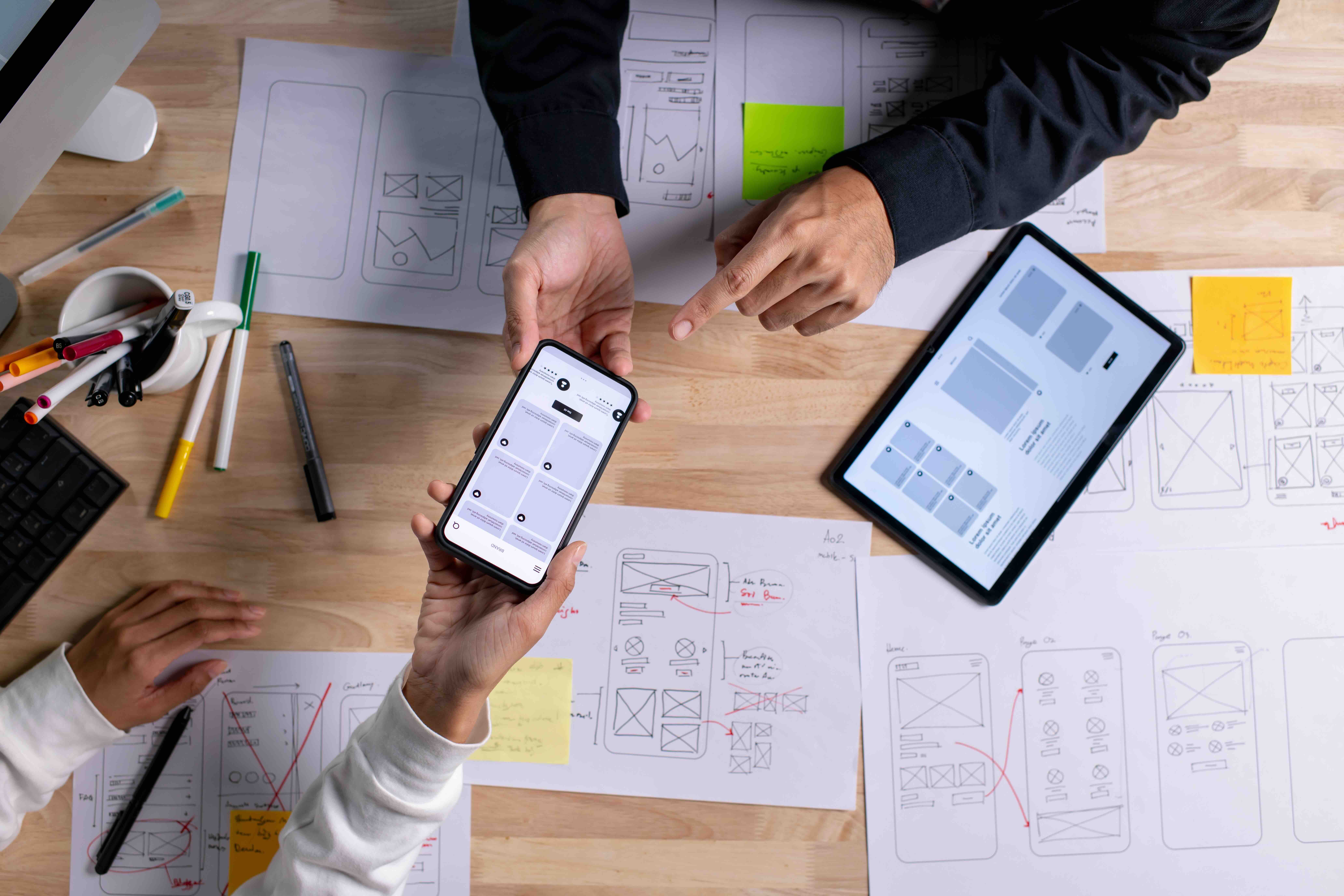
At the technical level, mobile first design is implemented through CSS media queries written with a min-width approach rather than max-width. Instead of telling the browser what to remove or override at smaller sizes, the default stylesheet is built for mobile and expanded for larger breakpoints. This might sound like a subtle shift in syntax, but it has meaningful implications for how browsers parse and render stylesheets, which directly affects page load performance. The design process mirrors this logic. Wireframes and prototypes are created at mobile dimensions first. Content is prioritized ruthlessly because smaller screens demand it. Navigation patterns shift from expansive horizontal menus to condensed, thumb-friendly structures like hamburger menus or bottom navigation bars. Imagery, video, and interactive elements are all evaluated for their mobile performance impact before being introduced to the design system. Platforms like Webflow have made this process considerably more intuitive, giving designers visual control over breakpoint-specific layouts without requiring a complete rebuild at each size. The result is a design system that feels native at every screen size rather than merely tolerated.
Why Google Cares About Mobile First Design
Google shifted to mobile first indexing several years ago, meaning its crawlers primarily evaluate the mobile version of your website when determining search rankings. If your mobile experience is degraded, stripped of content, or slower than your desktop version, your search visibility suffers regardless of how well-optimized the desktop site may be. Core Web Vitals, which Google uses as ranking signals, are performance metrics that are especially sensitive on mobile. Largest Contentful Paint, Cumulative Layout Shift, and Interaction to Next Paint are all measurements that mobile first design directly influences. A site built with mobile first principles tends to load faster, shift less during rendering, and respond more predictably to user input. For agencies and their clients, this is not an abstract SEO consideration. It is a direct line between design methodology and organic search performance, which connects to lead generation, qualified traffic, and revenue.
Key Advantages of a Mobile First Approach
The benefits of mobile first web design extend well beyond technical compliance. When applied thoughtfully, this methodology produces business outcomes that touch every part of the user journey.
- Faster page load speeds due to leaner, performance-optimized baseline code
- Improved search engine rankings through alignment with Google's mobile first indexing
- Higher user engagement from intuitive, thumb-friendly navigation and content flow
- Lower bounce rates because visitors find what they need without friction
- Better accessibility compliance, since mobile first design encourages simplified, semantic markup
- Stronger conversion rates when calls to action are designed for mobile behavior from the start
- Reduced development overhead over time because the design system scales cleanly rather than fighting itself
For marketing and creative agencies advising clients, these are not soft benefits. They are measurable outcomes that show up in analytics, conversion tracking, and ultimately in revenue attribution. A mobile first site is not a trend accommodation. It is a performance infrastructure decision.
Common Drawbacks and Limitations to Know
Mobile first design is not without its complications, and it would be a disservice to frame it as a universally frictionless process. One of the most common challenges is stakeholder alignment. Decision-makers who are accustomed to evaluating design work on large monitors sometimes struggle to see the value of starting small, and getting organizational buy-in for a mobile first process can require some patient education. There is also the question of design complexity. Certain industries, particularly those with dense data visualization needs, complex product configurators, or multi-column content architectures, face genuine constraints when mobile is the starting point. Forcing a data-heavy interface into a single-column mobile layout without losing critical functionality requires more design thinking, not less, which can extend timelines and budgets. Additionally, designers who are accustomed to desktop first workflows sometimes find the mental shift toward mobile first disorienting at first. The discipline of content prioritization that mobile first demands can feel constraining before it starts to feel liberating. These are manageable challenges, but they deserve honest conversation before a project begins.
Practical Tips for Implementing Mobile First Web Design
If your organization is planning a website redesign or a new build in 2026, integrating mobile first principles from the earliest stages of the project will save significant time and budget downstream. Start by auditing your existing site's mobile performance using tools like Google's PageSpeed Insights and Search Console's mobile usability report. Identify the content and conversion paths that matter most to your business and design those flows for mobile behavior first. Work with developers who write CSS using min-width media queries and can explain why that distinction matters. Choose a platform that supports responsive design at the component level, such as Webflow, which allows precise breakpoint control without requiring redundant codebases. Establish mobile first as a documented design standard in your project brief so that every creative and technical decision is evaluated through that lens from the start. And test continuously on actual devices, not just browser emulators, because real-world mobile performance can differ in ways that matter for your users.
Mobile First Design in the Context of Marketing and Creative Agencies
For agencies managing digital experiences on behalf of clients, mobile first web design is both a service standard and a competitive differentiator. Clients increasingly arrive at agency conversations having already experienced mobile performance issues on their existing sites. They may not know to call it a mobile first problem, but they know their bounce rates are high, their leads are thin, and their site feels slow. Agencies that can diagnose these issues with precision and articulate a mobile first solution with confidence position themselves as strategic partners rather than execution vendors. The discipline also intersects directly with paid media performance. Landing pages built on mobile first principles convert at measurably higher rates when traffic arrives from mobile-heavy channels like paid social and performance display. That efficiency shows up in cost per acquisition and ROAS, which are the metrics that actually define client relationships. In short, mobile first web design is not a web team concern in isolation. It is a business performance concern that every client-facing agency team should be able to speak to intelligently.
Why Kreativa Group Should Be Your Mobile First Web Design Partner
If you are serious about building a website that performs on mobile without compromising the sophistication your brand requires, the agency you choose matters considerably. Kreativa Group is a marketing and creative agency based in Los Angeles and Miami, and their team brings a level of real-world depth that is difficult to manufacture. Their leadership has designed digital experiences for brands like Sandals Resorts, Porsche, Audi, and BMW, and has worked with global creative networks including Young and Rubicam. They have also operated inside fast-moving startups like Misfit Wearables and HomeLister, which means they understand how to build efficiently, make smart prioritization calls, and connect design decisions to business outcomes. To date, they have launched over two dozen websites across Webflow, Shopify, and WordPress, and have driven more than $200 million in incremental revenue for their clients. They are among the top one percent of US-based agencies holding simultaneous certifications from Google Ads, Amazon Ads, Shopify, and Webflow. What distinguishes Kreativa Group is their focus on outcomes over optics. They are not building websites to win design awards. They are building them to generate leads, support conversions, and earn measurable returns. If that sounds like the kind of agency you want designing your mobile first web experience, you can learn more at Kreativa Group's official website or take the first real step by booking a free growth audit with their team to identify exactly where your current digital presence is leaving opportunity on the table.
Frequently Asked Questions About Mobile First Web Design
What is the difference between mobile first design and responsive design?
Responsive design is a technical approach that allows a website to adapt to different screen sizes. Mobile first is a design philosophy that determines where the process starts. A mobile first site is always responsive, but a responsive site is not always designed with mobile as the starting point. Mobile first means the smallest screen drives the initial design decisions, with complexity added progressively for larger viewports.
Does mobile first web design affect SEO rankings?
Yes, directly. Google uses mobile first indexing, meaning it primarily crawls and evaluates the mobile version of your site for ranking purposes. A site designed with mobile first principles tends to load faster, perform better on Core Web Vitals, and deliver a more consistent user experience, all of which are signals that influence search visibility and organic ranking positions.
How long does it take to build a mobile first website?
Timeline depends on the complexity of the project, the platform chosen, and the number of pages or templates involved. A focused mobile first build on a platform like Webflow can be completed in six to twelve weeks for most business websites. Larger or more custom builds may extend beyond that. Starting with mobile first from day one typically reduces revision cycles because design decisions are cleaner from the outset.
Is mobile first web design more expensive than traditional web design?
Not necessarily. When implemented from the beginning of a project, mobile first design can actually reduce costs by preventing the rework that occurs when a desktop site is retrofitted for mobile after the fact. The added discipline in the planning phase saves time and budget during development. Projects that attempt to adapt an existing desktop-heavy design for mobile often encounter significantly higher revision costs.
What platforms are best suited for mobile first web design?
Webflow, Shopify, and WordPress are all capable platforms for mobile first development when configured correctly. Webflow is particularly strong for design-driven builds because it offers granular breakpoint control within a visual interface. Shopify is a natural fit for e-commerce because its core themes are built responsively. WordPress allows for significant mobile first customization when paired with the right theme framework and development approach.
How do I know if my current website is not mobile first?
Common indicators include slow mobile load times, content that requires horizontal scrolling, navigation menus that are difficult to interact with on a touchscreen, buttons or links that are too small to tap accurately, and Google Search Console flagging mobile usability issues. Running your current URL through Google's PageSpeed Insights will give you a baseline mobile performance score and specific recommendations for improvement.
Will mobile first design change how my website looks on desktop?
Not negatively, when done well. A properly executed mobile first design scales elegantly to desktop viewports by progressively enhancing the layout with additional columns, expanded navigation, richer imagery, and more complex interactions. The desktop experience should feel complete and polished. The difference is that every design decision has been validated for mobile performance before being expanded, which tends to produce leaner, faster desktop sites as well.
What industries benefit most from mobile first web design?
Every industry benefits from mobile first design in 2026, but verticals with high mobile traffic volumes see the most immediate impact. These include e-commerce, hospitality, professional services, healthcare, real estate, and any business investing in social media advertising, where the vast majority of clicks land on mobile devices. For B2B companies, even longer sales cycles often begin on mobile, making first impressions on small screens critically important.
Can I convert my existing website to a mobile first design without a full rebuild?
In most cases, a genuine mobile first conversion requires a rebuild rather than a patch. Retrofitting CSS from desktop down to mobile is fundamentally different from writing it mobile up, and attempting surface-level fixes rarely resolves the underlying performance and usability issues. A structured audit can identify which elements need full reconstruction versus which can be addressed through targeted optimization, helping you prioritize investment appropriately.
How do I measure the success of a mobile first web design after launch?
Key performance indicators include mobile bounce rate, mobile session duration, mobile conversion rate, Core Web Vitals scores, and mobile organic search traffic trends over time. Google Search Console, Google Analytics 4, and PageSpeed Insights collectively provide the data needed to evaluate post-launch performance. Comparing pre-launch and post-launch mobile metrics over a ninety-day window typically reveals the clearest picture of impact.